Thorn Cathcart Realtor.
A real estate agent is someone you trust to help you make one of the biggest purchases you’ll ever make. It is a demanding job that requires a strong personality, work ethic, and a strong brand to go along with it as well.

Brand positioning
Thorn Cathcart is a modern real estate brand identity rooted in confidence, clarity, and refined professionalism. Every visual element is intentional—designed to feel elevated yet approachable, bold yet timeless—reflecting a high‑touch experience and a strong understanding of market sophistication.
It’s designed to give distinction to Thorn but still live in the visual framework of Carolina One Real Estate.
Overall brand identity
The Thorn Cathcart brand is confident without being loud, luxurious without being inaccessible, and modern without chasing trends. Its visual language supports what clients feel immediately: trust, expertise, and a polished experience from first impression to final closing.
Brand colors & logo description
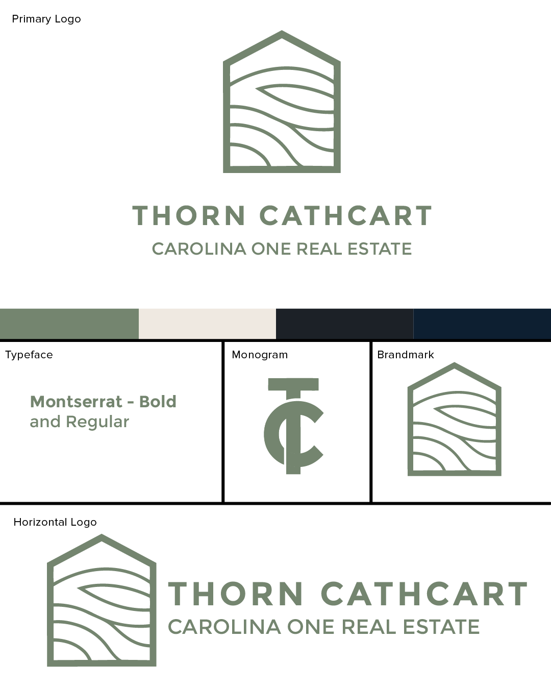
Logo Design & Structure
The Thorn Cathcart logo is a clean, modern identity built around strong typography and confident simplicity. The primary logo system consists of a typeface-forward wordmark paired with a monogram brandmark, giving the brand flexibility across digital, print, and signage applications.
The horizontal logo lockup features the name THORN CATHCART prominently, with CAROLINA ONE REAL ESTATE serving as a supporting identifier. This hierarchy reinforces brand recognition while anchoring the business within its larger real estate network. The layout feels balanced and professional, designed for clarity and instant legibility.
Typography
The brand uses Montserrat in both Bold and Regular weights. Montserrat is a contemporary, geometric sans‑serif typeface that communicates confidence, approachability, and modern professionalism. The bold weight gives the logo visual authority, while the regular weight provides contrast and readability in supporting text. This typographic choice aligns well with real estate branding—clean, trustworthy, and polished without feeling cold.
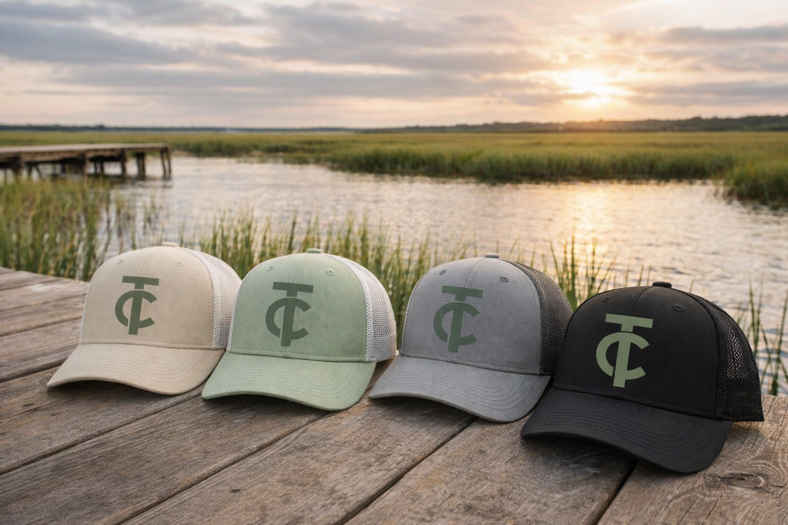
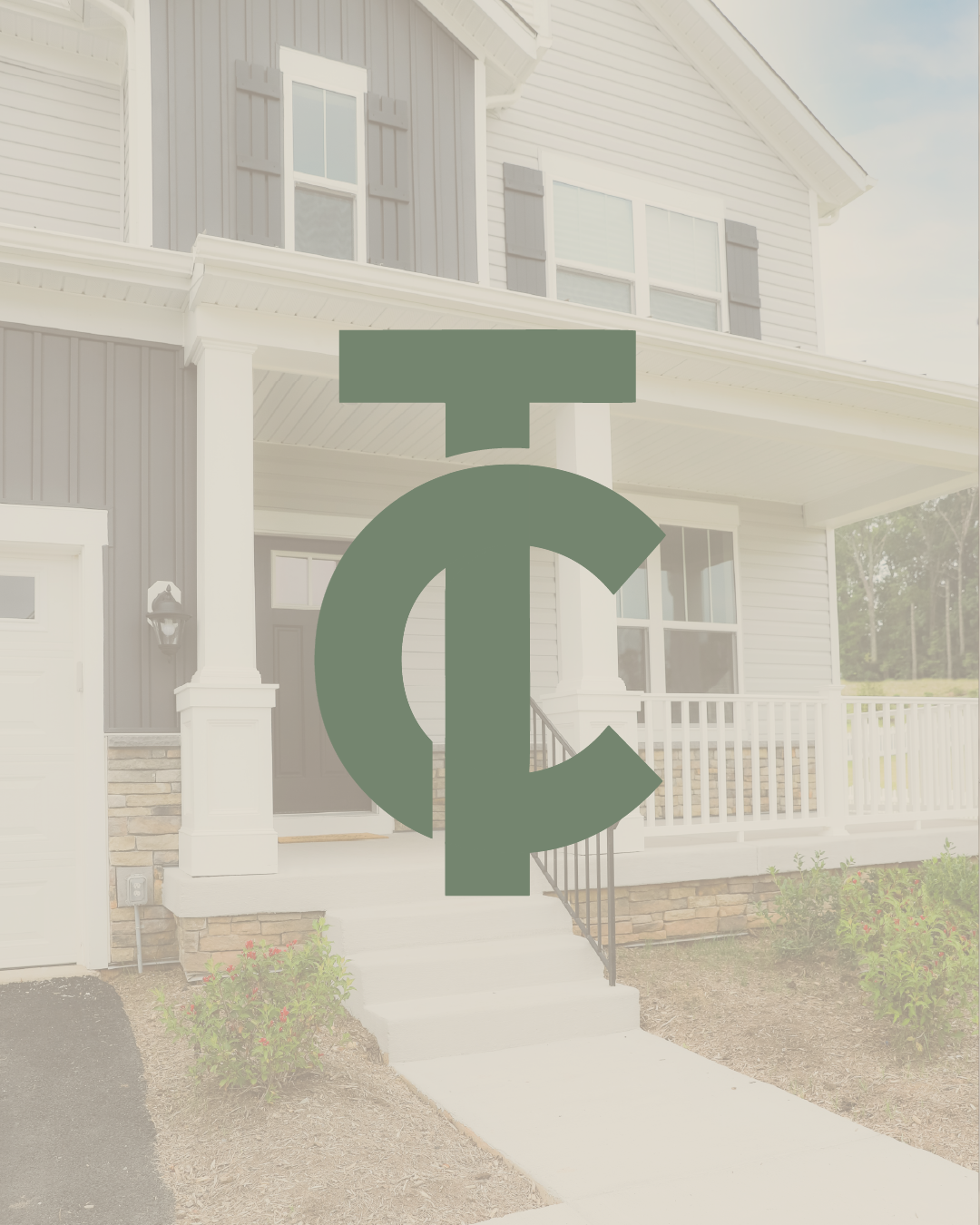
Brandmark
The monogram brandmark distills the brand into a concise visual symbol, making it ideal for social media, signage, favicons, and branded materials where space is limited. Its typographic construction keeps the identity cohesive and ensures that even simplified applications remain unmistakably “Thorn Cathcart.”
Color Palette
The Thorn Cathcart color palette is muted, architectural, and sophisticated, designed to evoke trust, stability, and understated luxury.
#0D1F31 (Deep Navy)
The anchor of the palette. This rich, deep navy conveys professionalism, intelligence, and credibility. It provides visual weight and serves as the foundation for the brand’s most authoritative moments.#1C2127 (Charcoal Black)
A modern alternative to pure black, this tone adds depth and contrast while maintaining a refined, editorial feel. It enhances typography and grounds the brand with quiet strength.#74856F (Muted Sage Green)
Soft yet confident, this organic green introduces warmth and balance. It brings a sense of calm, approachability, and connection—perfectly complementing the brand’s professional core with a human touch.#EFE9E1 (Warm Ivory)
Light, airy, and timeless, this warm neutral creates breathing room throughout the brand system. It softens layouts, enhances readability, and adds a sense of elegance without feeling stark or cold.